Islip Cleaners
Content + Visual Development, Web Development
Islip Cleaners provides exceptional, quality service for customers and their garments. They use eco-friendly cleaning agents as well as state-of-the-art equipment to deliver the best and safest products possible.
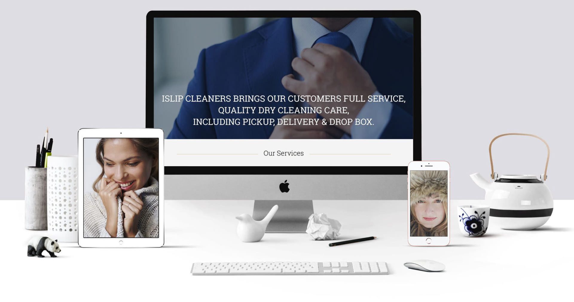
We were hired a second time to develop another new brand for Islip Cleaners. As technology changes, so does the need to execute a more modern, responsive web presence. Engaging visuals, conversational type written copy, and easy navigation clearly communicates their brand creating a connection with their audience.


“We love details. We believe they make the difference.”
Behind the Scenes
We reinvented a Main Street USA dry cleaners web presence into a beautifully, stunning, service-orientated digital user experience. We incorporate sound design principles that focus on ease of navigation, website usability guidelines, and smart, clean content layout.
Client: Islip Cleaners


DID YOU KNOW?
Responsive web presence and website usability guidelines
1. Plan a sitemap.
When you start the process of creating a website, the first and most important step is to create a site map. A site map gives you a clear and full view of what the entire content of the website will look like. The map will lay out and organize different areas of focus throughout the site, determining which types of content should go on which pages. It specifics important information like different tiers of the website and where to place shortcuts to different pages.
2. Use branded content.
Your website is an important marketing tool that can help you strengthen your brand. On your website, it’s important to have great and visually appealing designs. This will both make your website more appealing to customers and help to strengthen your brand as a whole. Copy and imagery throughout the website should not only be engaging and well designed, but consistent with your brand image. Many times a new brand is created within the website itself first, then trickles down to other advertising and marketing initiatives.
3. Create product and service centered content.
Whatever it is that your company is trying to sell, you need to have content on your website centered on it. Incorporate beautiful photos and engaging descriptions of your products. If you offer services, make it clear what you do and how your services can benefit the customer. It’s often a good idea to incorporate customer testimonials to attest to the quality of your services and products. However, make sure these testimonials are genuine, include them alongside your own persuasive text, not by themselves.
4. Make use of clear calls to actions.
When creating a website, keep one thing in mind: what do you want visitors to actually do? You might be trying to sell products or services directly, or you might be aiming to create customer interaction through newsletters and social media. Whatever it is, make sure to be direct. Don’t just show your product; have a clear way for customers to obtain it. Also make sure to tell your customers why they should take action right now. If you have a newsletter, tell them to sign up because you’ll keep them up to date on your newest offers and information. Your conversion rates will increase if you have clear calls to action that motivate your customers to act and have clear ways for them to actually take action.
5. Make smart use of space, sizing and headlines.
There are many rules and general best practices to consider when formatting a website. White space can be important for reading comprehension, so make sure to incorporate good spacing and margins on text-heavy parts of your site. You don’t want to cram too much content above the fold, but your most important information should usually be there. Make the most important links bigger than others to make them stand out to viewers. Make your headlines large, concise and informative to draw attention and let viewers know what to expect.
6. Create your mobile strategy at the same time as your desktop strategy.
It’s extremely important to have a responsive site that is optimized for all mobile devices. Mobile browsing is increasingly popular, and it’s likely that a large percentage of potential customers will look you up on their phones or tablets. When this happens, you need to have a working site to greet them with. These days, it is imperative to have a responsive site. A site that isn’t optimized for mobile may give an impression of unprofessionalism.
7. Use open source platforms.
Using an open-source system like WordPress with a Content Management System (CMS) is helpful because it means any developer can access your site. In general, open source tools will make it easier to make changes to your site in the future.
8. Perform regular maintenance.
Work on your website doesn’t end when it’s launched. It’s vital to perform regular patience to ensure your website is working properly. You will need updates to plug-ins and themes, and you should backup your site often to be safe from crashes. Some hosting companies will perform this service, but it will be defendant on the types of hosting plans they have. These plans will also lack the human element. The maintenance will be automated, so if an update breaks something, it won’t be noticed or addressed, and the client will need someone to step in and fix it at a cost. Many maintenance plans through the hosting company will just offer backups and WordPress updates, but won’t update themes or plugins.

